Design System:
built from zero
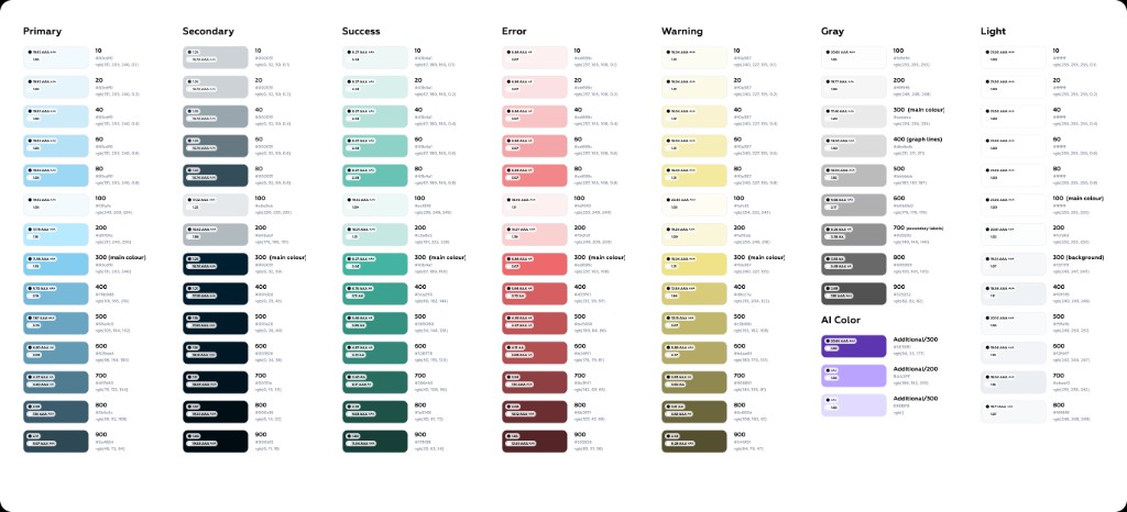
I owned the creation of IntegrityNext's design system from scratch — not polishing an existing library, but defining foundations, structure, and governance so design and engineering could move at the same speed, in a way that's legible to both humans and AI tooling.
Context
When I joined this initiative, IntegrityNext had no shared design system in the modern sense. UI had grown organically — designers worked from scattered patterns, engineers relied on a legacy MUI theme and ad hoc components, and there was no single source of truth connecting design decisions to code. Handoffs were slow, inconsistent, and hard to scale, especially as the product expanded across sustainability, compliance, and supply-chain workflows.
As Product Design Lead, I owned creating a design system from scratch — defining foundations, structure, and governance so design and engineering could move at the same speed.
The challenge
The core problem was never missing buttons or colors — it was a missing system:
| Gap |
|---|
| No token architecture for color, typography, spacing, elevation, or breakpoints |
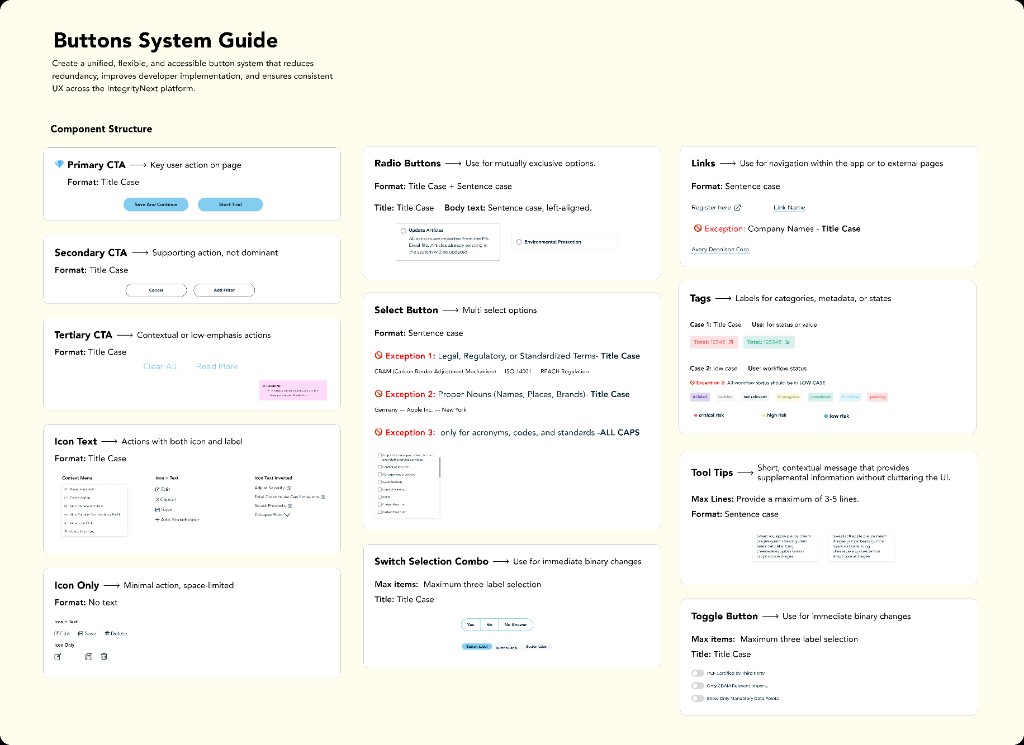
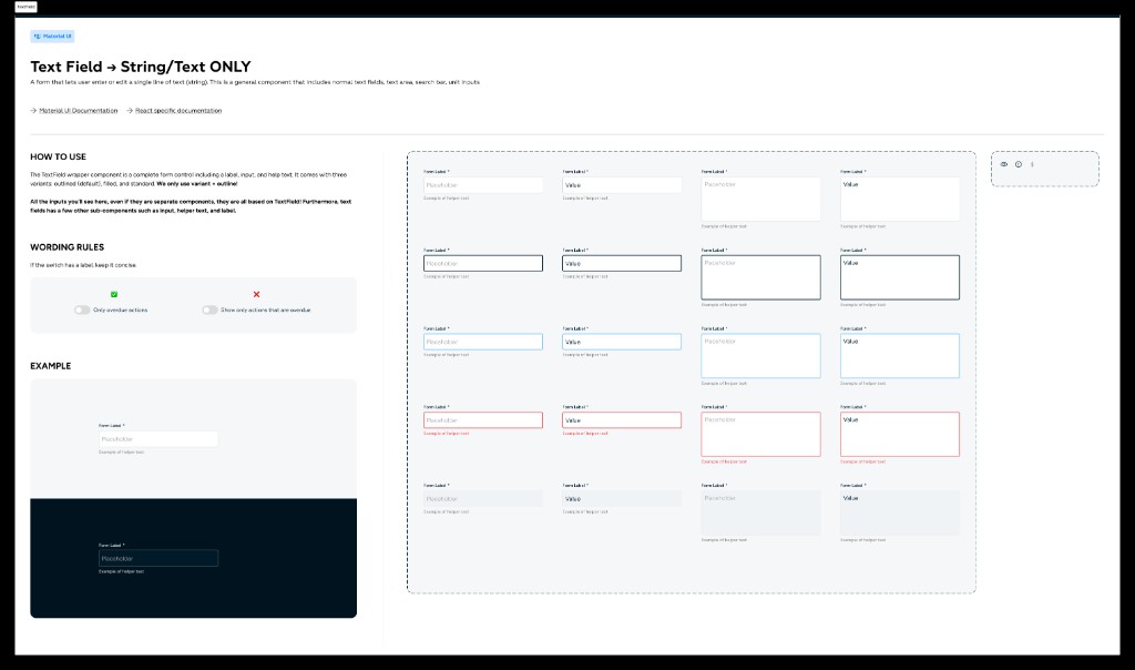
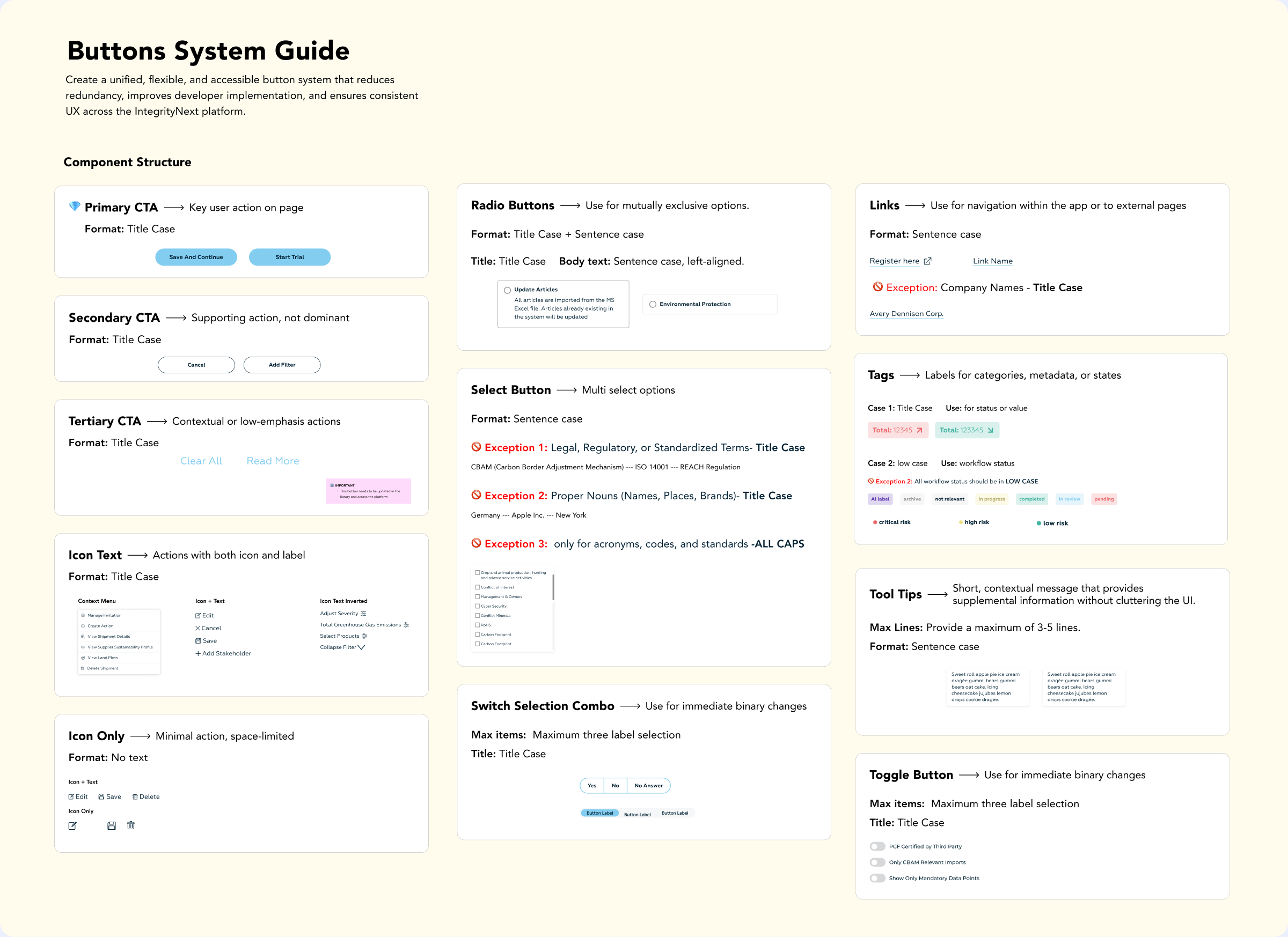
| No consistent component variants, states, or usage rules |
| No structure designers and developers could both navigate |
| No format readable by AI tooling (Cursor, Claude) for faster prototyping and handoff |
| High cost every time a screen moved from wireframe → hi-fi → implementation |
The business needed faster delivery, stronger design–dev alignment, and a foundation that could eventually support white-label and theme variations — without rebuilding from zero again.
Approach
I framed the work as a two-phase initiative.
Underneath both phases, I applied atomic design — atoms (tokens, icons, base styles) → molecules (inputs, chips, list items) → full components and patterns. Every component includes written descriptions, so the system is legible to humans and to AI assistants, not only as pixels in Figma.
What I built
Visual examples
Click any image to enlarge
Impact
| Area | Outcome |
|---|---|
| Speed | Wireframe → hi-fi → dev handoff is faster, with fewer"which button?" debates |
| Consistency | Shared tokens and component rules reduce one-off UI across dashboards, assessments, and modals |
| Design ↔ Engineering | MUI-aligned structure and naming gives developers a familiar mental model, with INX-specific customizations documented |
| AI / tooling | Tokenized, described components enable Cursor-readable specs and Claude-based prototyping |
| Scalability | Token architecture is built to support future modes — dark theme, white-label — without a full rebuild |
Key decisions
MUI-like structure, custom INX design. Borrow familiarity, not generic Material aesthetics.
Usage rules, not just components. Every token and component answers when and why, not only what it looks like.
Atoms → molecules. Composable, maintainable, and agent-parseable by construction.
Documentation as a first-class deliverable. The system lives in Figma and in a written spec agents can consume — not just in designers' heads.
Incremental code adoption. The design system lands in product incrementally — no forced big-bang migration.
Reflection
This project was not a visual refresh. It was infrastructure for how IntegrityNext designs and ships UI. Starting from zero, I defined the initiative, built the tokenized Figma library, wrote the cross-functional specification, and created an AI prototyping workflow — so design quality scales with the product, not with individual heroics.
Live and in review.
The next phase is deepening variable and mode rollout, completing component contracts in code, and expanding standards — accessibility, UX writing — on the same foundation.